You’ve spent a lot of time and money building a website. But do you know if the site architecture and design are giving you the biggest bang for your buck and getting visitors to take actions that lead to conversion?
In the good old days, you had to gather (and pay) groups of people and sit in a room all day to watch them click around your website. Focus groups are time-consuming and expensive. Moreover, the results might not be representative or accurate because of the small sample size and observed user behavior changes.
Nowadays, you can use heatmaps to find out if your visitors are clicking on calls-to-action you want them to click and be able to tweak your copy and layout in real-time to optimize conversion.
This article will explore how heatmaps can help us increase conversion.
What is a web heatmap in the context of design and conversion?
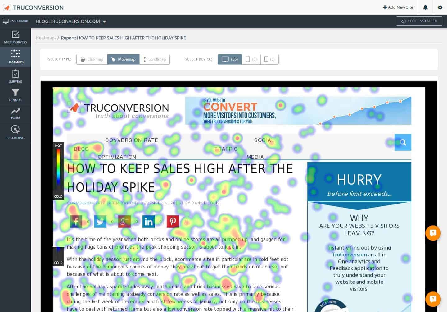
A heat map is a form of visual analytics. It’s a two-dimensional visual representation of data in which colors represent values.
In website design, heatmaps show how visitors interact with the information and graphic elements displayed on a web page and provide insight into how layout and user experience design impact users’ actions and, thereby, conversion.
While analyzing numbers and data can only tell you which pages are underperforming, visual analytics in the form of heatmaps can show you which element(s) on a page needs adjustment so you can maximize its performance.

How are heatmaps generated for a webpage?
Most heatmaps are created using click-tracking software that translates where a user places the cursor and presses the mouse button into a 2-dimension color-coded visual.
While there are two kinds of tracking – eye-tracking and mouse-tracking – the latter is more widely used because you can get a much larger sample size at a fraction of the cost of the former.
There are a few types of heatmaps designed to track different kinds of data and types of interaction:
- Mouse-tracking Heatmap shows how users read and navigate a page. Most of the mouse movement heatmaps also indicate how many visitors hover over a particular page area so you can see which part commands the most attention.
.

- Scroll Map shows the user scroll and where they abandon the page. As a result, it can provide insight into how to adjust the length of your content, and where to place critical calls-to-action, to maximize the effectiveness of your web pages.

- Click Map shows where visitors are clicking so you can weed out distracting links and direct attention to the calls to action critical to conversion.
- Eye-Tracking Heat Map shows what visitors are looking at on your website. It’s more complex to set up and more expensive to run the tests due to the technology and software involved, and it’d be conducted like a focus group.

Why use Heatmaps?
You can learn a lot about user behaviors by studying heatmaps: what users focus on most, how they react to your calls-to-action, and whether they’re navigating the website the way you intend them to.
Heatmap website conversion provides real-life data based on your ideal customers, the type of products or services you offer, the various design and text elements, and how they interact with each other on your website.
Instead of speculating how a specific user experience design or graphic layout would work for your website, you can test and tweak it in real-time to maximize your results.
Besides the wealth of website heatmap data they provide, most are incredibly cheap to create.
In the past, to obtain the breadth and depth of data provided by most heatmaps, you’d have to gather many people and spend a sizable budget on focus groups.
Even then, you’d have a limited number of data points, and the data could still be inaccurate because focus group participants might modify their behaviors because they are “under observation.”
Nowadays, you can use website heatmaps to gather data from a large sample of users without leaving the comfort of your office chair.
The data is more accurate, representing many users most likely to be your ideal clients or customers interacting with your website in their “natural” environment.
The data gathered can inform the design and development of your website, so you can adjust the graphic layout and user experience to increase conversion.
Heatmaps help improve the user experience, which leads to higher conversion!
One of the most effective ways to increase conversion is to improve the user experience.
When you put a call-to-action on your website, the goal is for the visitors to click on the button (e.g., to subscribe, add to cart, or checkout.)
How do you know your website structure and page design are accomplishing the goal?
Heatmaps can provide the answers to these critical questions regarding the user experience that affect conversion:
- Can visitors quickly locate the call-to-action (CTA)?
- Is the instruction on the page explicit, so visitors are moving through the user journey that leads to sales and conversion?
- Are there elements that look clickable but, in fact, static? If users try to click on those elements, do they get frustrated and leave your site?
- Are there elements on a page distracting visitors from your intended CTA so that instead of taking the necessary action they navigate away from the page?

Studying heatmaps generated for your website can show you areas on a page that receives the most attention and develop the most actions so you can validate if the website structure and page design are optimizing conversion rate.
8 Ways to Use Heat Map To Increase Conversion
The extensive qualitative and quantitative data provided by different heatmaps can give us beneficial information to increase sales and boost conversion rate on a website by showing us if visitors are following the call-to-action we want them to take.
Here are 8 Ways to Increase Conversion by Using Heatmaps and understanding how to optimize your website structure and design:
1. Gauge effectiveness of CTA
A call-to-action is as good as the number of people who click on it. A click map can show you where visitors click on a webpage and help you assess the effectiveness of a CTA.
Combining the A/B split test with a click map can give you quantitative insight to help maximize various user experience elements, such as placement of CTA, copy of the CTA button or text, and CTA button design to optimize conversion rate.
2. Understand how visitors react to content
The user clicking precedes not all conversions on a CTA. For E.g. someone might read some copy about a sale and go on to browse your products on the same page. They did not have to click on anything, but the copy achieved the goal.
To get a sense of how visitors react to content, you can use a mouse-tracking map to observe where cursors stop and deduce what content is interesting to your visitors.

3. Optimize placement of CTA
Eye-tracking, Mouse-tracking, and Click maps can help identify areas your visitors tend to direct their gaze or hover their mouse over. These are the areas that command their attention either because of how we read (left to right, top to bottom in most western cultures) or the page layout.
According to this case study, people from English-speaking cultures almost always browse in an F-shaped pattern that heavily favors the left side of the screen.
These areas on a page would be an excellent place to put your conversion-focused text and calls to action to maximize their effectiveness.

In this case study, Dennis Publishing determined from eye-tracking heat map study that visitors pay much attention to the left-hand column of the site. As a result, they shifted their Google ad to the left pane site-wide. As a result, CTR has increased by 44%, and RPM (revenue per 1000 ad impressions) increased by 48%.

4. Streamline page design
Are there any “dead weights” on your web pages contributing nothing to improving the user experience or conversion rate?
To find out, you can use mouse-tracking maps and click maps to identify content and elements that receive little attention.
At best, they’re not helpful to your visitors, and at worst, they distract them from calls-to-action that lead to conversion.
You can remove elements that are not getting attention based on the results from heatmaps. You can also consider replacing them with other content and observing the results closely to optimize your page.
In this case study, with the help of a heat map, Pair realized the navigation bar was distracting visitors from clicking on the conversion button to download the app.
By hiding social share buttons, navigation bar, and the “download for free” text, the company could focus users’ attention on the primary CTA and increase conversion by 25%.
5. Reduce cart abandonment and increase shopping cart conversion
In this case study, “The North Face” found out from a heat map study that visitors got distracted by a banner on the shopping cart page. Instead of continuing to checkout, many potential buyers clicked on the banner and got taken off the checkout path. By adjusting the placement of the checkout button, The North Face increased click-through to the checkout page by 21%.

Use click maps to find where your visitors click on the shopping cart page.
- What were they clicking on if they did not navigate the checkout page?
- Can any of those elements be repositioned or eliminated so more attention can be given to the checkout button?
- Were they able to quickly locate the checkout button, or had the mouse been all over the place to search for it?
Looking at the mouse-tracking heatmaps to see which part of the page commands the most attention can give clues on where to put your checkout call-to-action.
6. Optimize Content Using Heatmaps
Even though most Internet users are savvy enough to scroll and therefore “the fold” is no longer a massive factor in page design, studies of scroll maps show that it still impacts whether your content is being seen.
Use information from scroll maps to understand where your visitors tend to abandon pages. See if your calls-to-action are placed above the point where most users leave the pages and adjust page length for maximum effectiveness.
Here are some stats for you:
- Web users spend 80% of their time looking at information above the page fold (meaning, the part of the webpage that’s visible when users first land there). Although users do scroll, they allocate only 20% of their attention below the fold.
- Users spend 69% of their time looking at the left half of the webpage and 30% viewing the right half.
You can also use click maps to compare visitors’ responsiveness to CTAs along the length of a page to determine optimal placement.
While giving visitors the chance to consume your content and build trust before you ask for their emails, you also want to make sure the scroll box shows up for most of them before they navigate away from your site.
Understanding where visitors tend to abandon a page can help you determine the placement for your lead capturing Opt-in box on your website and increase your opt-in rate.

7. Replace “dead ends” with CTA
When visitors get to the end of a page, are they clicking through to another page on your website?
If not, you have a “dead end” on your hand. Not only does this create a poor user experience, but you’re also missing out on an opportunity to further connect with or engage users.
A click map can help you identify these dead ends so you can add a relevant call-to-action to increase the effectiveness of your content.
8. Get more out of your images
By combining A/B tests with heat map tracking, you can test the effectiveness of various images on your website and see how they affect visitors’ interaction with your content and calls to action.
The direction of eye gaze has been found to impact conversion rate by directing the users’ attention to text and CTAs.
In this case study, more attention is commanded by the text and call-to-action when the baby’s gaze is directed toward that area on the page.


You can use various web analytics tools to generate heatmaps, gain insights into how users interact with your website and understand how you can maximize your conversion by maximizing page layout, content length, calls-to-action, etc.
Even Google Analytics got in on the action as it can monitor visitor behavior, determine how long visitors spend on a section of your content, identify navigational gaps, and more.
GA is just one of the many heat map tools on the market. So when choosing one, consider how the rest of the features work together to help increase your website’s conversion rate.
Also, please consider the variety of visitor data a website heatmap tool generates, whether it addresses mobile and desktop usage, and the types of reporting available.
But compared to other analytics tools, TruConversion offers an all-in-one analytic and feedback application that helps you understand your visitors and how they interact with your website to increase conversion, get your hands on .
Comments
One response to “Website Heatmap: 8 Ways to Increase Conversion”