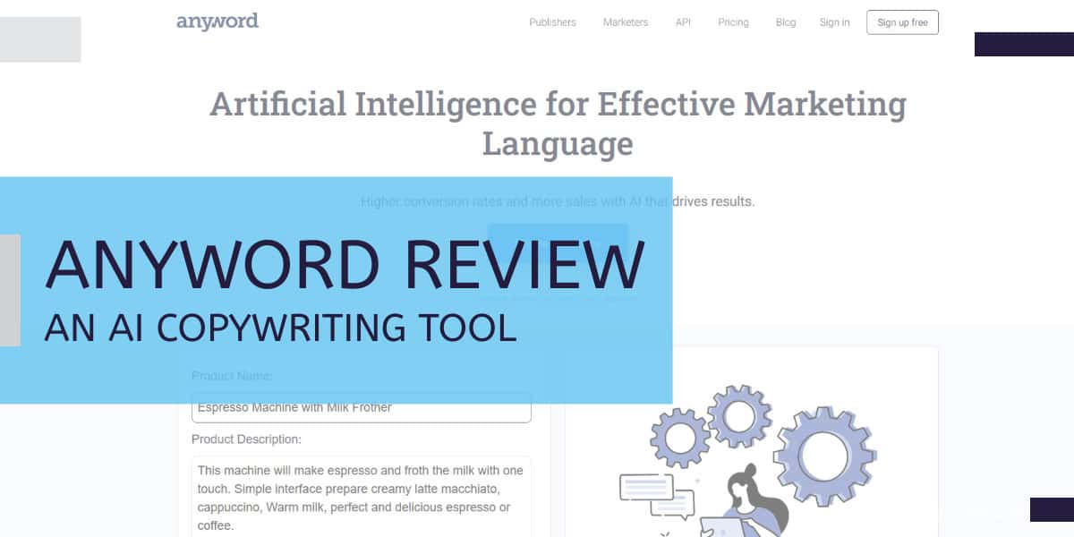
7 Most Critical Landing Page Elements for Higher Conversions

Last Updated on 4 months by Christopher Jan Benitez

As a freelance writer, I rely on inbound marketing to generate leads. Instead of sending pitches to writing gigs from different sites, I attract people looking for writers to my site.

From there, my site takes care of the rest. Normally, they fill out a form on my site asking about how my services work and whether or not I’m available for the project they have. This immediately puts me in touch with them so we can discuss the project’s specifics before we strike a deal.

Building an inbound marketing strategy takes hard work and lots of effort. But once you have implemented your strategy, you can attract a steady stream of leads over time without you lifting a finger!

The success of your inbound marketing rests on your landing pages. By designing the best possible pages for your site, you can convert them into clients in now.

In this post, you will learn:

  • the different landing page elements you need for your site
  • how I designed the landing pages on my website to increase my conversion
  • actionable tips on how you can make a high-converting website for your business using the most important landing page elements

What landing pages elements do I need to worry about?

To begin, we need to define what landing pages are. Also commonly referred to as destination pages and lead capture pages, these pages are where users land once they click on a search engine result link or an online land.

For your landing page to be effective, it must be optimized to improve your conversion levels. However, this can be a lot easier said than done. It all starts with ensuring your landing page contains all the critical elements.

To help you understand the landing page elements, I will use screenshots of the highest-converting page on my site: my homepage. From here, you will get a better idea of how to design your landing pages and how to approach each element on your site.

1. Fast loading speed

Your landing page needs to be quick to load. If it is not, you can rest assured that many people will simply hit the back button and look elsewhere. A study concluded that around 25% of visitors leave a site page that loads longer than four seconds.

To determine if your site loads longer than that, you need to run a test on Pingdom and GTMetrix to see how fast your site loads and why. Both tools provide technical reasons that explain your site’s speed performance. You may need a developer or programmer to help you make sense of the report.

However, you can fix most site speed issues by migrating your site to a faster hosting. I suggest using Siteground* for all your hosting needs. They provide better resources and tools to make your site load the fastest time possible. Also, they give you a free SSL certification to secure your site, which is now an SEO factor. Lastly, you can easily connect your site to CloudFlare CDN to help ease the load on your server and make loading time much more efficient for visitors.

If you’re looking for a more comprehensive way to fix your website’s site speed, read this post. It discusses actionable ways to make your WordPress site load faster. The tips also apply to other website platforms, so you should try this post. Also, consider running a technical SEO audit for the page to identify other SEO issues you must address.

2. A strong Call-To-Action (CTA)

You need to make sure that your CTA cannot be missed. When someone lands on the page, their eyes should immediately divert to this element. Make sure you are making a compelling offer to your visitors and getting them riled up.

The most important call to action occurs above the fold or the page area visitors see once your site loads. Here’s a screenshot of MTB Rules‘ CTA above the fold:

mtb rules

The CTA indicates that this is the button to click for all visitors to get things started.

Next, consider the colors you use carefully, as they have a strong impact on a person’s emotions.

To help you see how color impact your conversion rate, below is an infographic from Carey Jolliffe about the psychology of color and the emotions that each invokes:

Your choice of color depends on your branding and color scheme, like the button on my homepage. However, according to studies, red is the best-performing color for your call-to-action buttons. Integrate this color into your landing pages as best as you can and track the performance of your CTA buttons.

3. Address hopes and fears

Your landing page should resonate with the customer, and to do this, you need to acknowledge their hopes and fears, catering to them with your solution.

Going back to the screenshot of my business, I painted the picture of having great content for their website using the best words possible. Content allows them to share their knowledge about their expertise and connect with their audience, who may be potential clients. Through effective content, they can build an online following which leads to them becoming clients eventually.

In my homepage, I addressed their hopes in relation to content. I could spin around the copy by striking fear into their hearts. Instead of focusing on the benefits of effective content, I could discuss what they’ll be missing out without content. Lower traffic, subscriber count, and sales are just some of the many disadvantages that spring to mind.

I opted for a more positive message in my web copy instead of focusing on the negatives. I think it’s important to set a positive precedent with your target audience instead of leading off with fear. However, it’s just how I want to position my brand. There is no right or wrong answer at this point.

But there is the answer with the highest conversion, which trumps all. You can test both approaches to see which version yields the most responses. You can run an effective A/B testing campaign for this purpose. To help you out, use a tool like TruConversion to keep track of your site’s heatmaps and record the activity of your visitors on your landing pages. The goal is for them to heed your CTA. If not, then there’s something wrong with how you frame your message among other factors.

4. Use videos and images

Visual interaction is also a must. How you present your message also affects in your conversion rate. If your landing pages are in plain text, then you’re not engaging your visitors visually. Therefore, expect a lower conversion rate as a result.

And simply including any old stock photos is not the answer, either. Your images and videos need to deliver a strong message, offering value and information in a way that text-only content cannot

By adding images an videos, you create a more dynamic feel to your landing page. For example, instead of typing out your offer to visitors, why not record a video instead or design a beautiful image to communicate your ideas?

I’m not a designer but I was able to build a decent website that explains what I do to my target audience and tells how I can help them. I use the self-hosted WordPress for building my site. The plugins and customization options make it the best CMS to build your site on, in my humble opinion.

This part of my landing page allowed me to introduce myself to people on a more personal level. Spoiler alert: I’m not really a serious business person as the image above suggest.

It took me years to create the design and layout I have right now for my site. Some of you may not have the patience to learn the basics of site design. You’re probably busy with more important tasks like working for your clients, which is a valid reason. That’s why Unbounce Builder lets you build WordPress landing pages to easily incorporate images and videos.

5. Simple design

When it comes to website design, many of us are guilty of getting carried away, which leads us to over complicate things. Instead, simple is best. It is of no coincidence that minimalistic websites have become so popular!

For freelance writers, a site with substance will always be much better than a flashy one. While it would be nice to have a great looking website, you don’t have to design one like it. Your main concern is to effectively share your skills to your audience and give them a reason why they should hire you. Even the simplest of web designs will suffice as long as you can incorporate the other landing pages elements listed in this post.

To prove my point and swallow my pride a bit, check out JoeCanWrite.com:

He ranks on the first page of Google results for the keyword “freelance writer for hire.” At first glance, his page is nothing to write home about. It uses the basic Page structure on WordPress as he runs down his skills and services. At the bottom, there’s a form people can fill out if they’re interested in his writing. There are no flashy graphics or videos that grab your attention. It just a simple, well-written page. And it’s dominating Google for a very good transactional keyword.

If Joe can design this page that Google loves, then you can too!

6. Trust signals

This is one of the most important elements of all landing pages. You need to earn the trust of every viewer that lands on your website. After all, online customers are skeptical today, and rightly so, as there have been so many fraud and data breach incidents that have occurred in the last few years. This is why you need to show them that your business is one that can be trusted. From security badges to testimonials from past customers, there are many different ways you can do this.

For me, testimonials are my favorite landing page elements. They help tip the scales to my favor for people who aren’t sure whether to hire me or not. Once they see established guys like Blogging Wizard’s Adam Connell, Nichehack’s Stuart Walker, and WPKube’s Devesh Sharma compliment my services, it changes the perception towards my services to a positive light.

This is the testimonial section of my homepage. It shows kind words from people whom I’ve worked with throughout the years. I was lucky enough to work with some of the best bloggers in the world. And I made sure to get their recommendations so I can show to the world that I’m good enough for the job!

Using testimonials from well-known clients as a sales tactic convinces people to hire you. Their words carry weigh in the decision-making process due to their reputation in their respective industries. Thus, it plays a critical role in using testimonials as social proof.

7. Several points of interaction

Finally, it would be best if you made sure there were various points of interaction. This includes the likes of online chat, a physical address, social links, a phone number, an email address, and a contact form. This ensures that there are many different ways for customers to interact with your business.

From the homepage, I have two main points of interaction, which is the CTA button above the fold and the chatbot widget at the right-hand button of the screen. I want to simplify the communication process from the homepage by first explaining to people who I am and what I do using the different landing page elements. If done correctly, they will click on the button on top of the page to learn more about my service. If they do, they will go to this page on my site:

Visitors are greeted with three calls to action, all of which are my different writing services. Each option has different colors to differentiate them from each other. If visitors scroll down the page, they will learn more about each service to help them decide the best option that suits their needs.

As mentioned, I have installed a chatbot so I can serve leads who wants to chat instead of clicking from one page to another. Chatbots are similar to contact form where you can answer in response to the question of the form or the bot. However, chatbots are much more powerful and dynamic than forms due to the conversational element in brings to the table.

If you click on the chatbot widget, it will open this dialogue on the page:

I still have to edit the first bubble (damnit), but the idea is to get a dialogue going with the visitor to get them to respond as if they’re talking to someone.

These are just some ideas on how you can approach points of interaction on your landing pages. A contact form is a great place to start so you can test and see the conversion rate. Over time, you can test different points of entry, such as CTA buttons leading to another page, sign-up forms, dynamic widgets, and more, in the hopes of improving your call to action.

Are you ready to put these landing page elements to great use?

You may not be able to use all these landing page elements immediately. Some of you don’t have testimonials yet to showcase to potential clients. Others don’t have the skills to create video content to explain what they do in creative ways.

Regardless, what’s important is a clear and well-defined landing page that lets your audience know you’re available for work or whichever your goal is. The elements above are just possible things you can add soon. In case the changes don’t pan out like you intended after monitoring them, you can always revert back to the page’s original settings.

You need to communicate your message effectively and prepare a simple call to action so people will respond positively to your landing page.